
Over time, we noticed that some of our components were being used incorrectly because our internal staff didn't have enough information on how to use it and it was all hidden away. As a result, our Freelancer.com website experience suffered as it became disjointed.
In 2022, we said, "Let's fix this." and we made it our mission to teach everyone about our design components and patterns.
This started us on a journey to turn Bits into a world-class design system.
Why focus on design system?


Building momentum towards a world-class design system.
Freelancer.com
Role
Product Designer
Timeline
Jan 2022 - Jul 2023
The Bits design system is used by designers, developers and product managers to build Freelancer.com's marketplace experiences.

Why focus on design system?
Over time, the team noticed that some components were being used incorrectly because our internal team didn't have enough information on how to use it and it was all hidden away. As a result, our Freelancer.com website experience suffered as it became disjointed.
In 2022, we said, "Let's fix this." and we made it our mission to teach everyone about our design components and patterns.
This started us on a journey to turn Bits into a world-class design system.
We are lagging behind
The current website is outdated, fragmented, and inconsistent. It led to problems like technical debt, a terrible user experience, and damage to our brand image.
A lot of teams didn't know how to use Bits properly, making the user experience even more disconnected over time.

We are lagging behind
The current website is outdated, fragmented, and inconsistent. It led to problems like technical debt, a terrible user experience, and damage to our brand image.
A lot of teams didn't know how to use Bits properly, making the user experience even more disconnected over time.
We are lagging behind
The current website is outdated, fragmented, and inconsistent. It led to problems like technical debt, a terrible user experience, and damage to our brand image.
A lot of teams didn't know how to use Bits properly, making the user experience even more disconnected over time.
We are lagging behind
The current website is outdated, fragmented, and inconsistent. It led to problems like technical debt, a terrible user experience, and damage to our brand image.
A lot of teams didn't know how to use Bits properly, making the user experience even more disconnected over time.
What was my involvement?
As one of just 5 team members, I saw that Bits needed attention. Taking the lead, I pitched and got approval for a makeover, bringing fresh energy to the team. My passion made a real impact, helping turn the redesign into a reality.
What was my involvement?
As one of just 5 team members, I saw that Bits needed attention. Taking the lead, I pitched and got approval for a makeover, bringing fresh energy to the team. My passion made a real impact, helping turn the redesign into a reality.
What was my involvement?
As one of just 5 team members, I saw that Bits needed attention. Taking the lead, I pitched and got approval for a makeover, bringing fresh energy to the team. My passion made a real impact, helping turn the redesign into a reality.
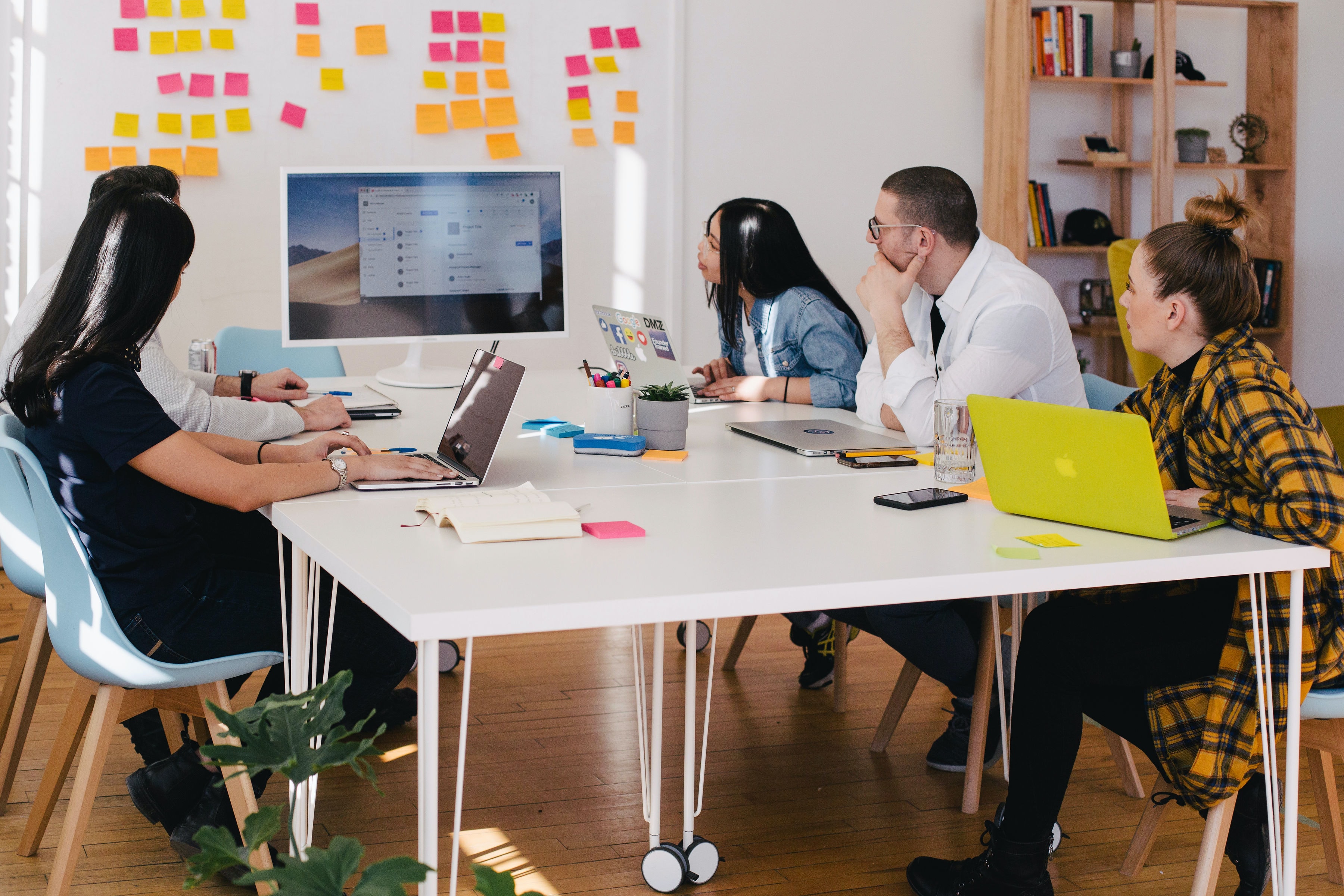
Leading workshops
I understood the importance of keeping stakeholders motivated throughout the redesign process. I focused on simplicity in workshops, making sure everyone was on board and enthusiastic about the upcoming changes.
By fostering active participation and highlighting the benefits of the new design, I built a strong sense of teamwork and enthusiasm among the team for the project.
Where do we start?
Our initial focus lies on the landing page, which poses the most significant challenge. It's currently cluttered and overwhelming, serving as the first point of contact for visitors on bits.freelancer.com.
A makeover for this page will significantly enhance the user experience, establishing a more inviting first impression. Once accomplished, we can channel our efforts into further improving the Getting Started and FAQ pages.
Leading workshops
I understood the importance of keeping stakeholders motivated throughout the redesign process. I focused on simplicity in workshops, making sure everyone was on board and enthusiastic about the upcoming changes.
By fostering active participation and highlighting the benefits of the new design, I built a strong sense of teamwork and enthusiasm among the team for the project.

Where do we start?
Our initial focus lies on the landing page, which poses the most significant challenge. It's currently cluttered and overwhelming, serving as the first point of contact for visitors on bits.freelancer.com.
A makeover for this page will significantly enhance the user experience, establishing a more inviting first impression. Once accomplished, we can channel our efforts into further improving the Getting Started and FAQ pages.
Critical issues
Navigating stakeholder opinions
The challenge involved managing diverse opinions from stakeholders, requiring a delicate balance to ensure everyone felt heard and satisfied.Striving for consensus
The primary objective was to seek solutions that appeased all stakeholders, avoiding potential complications in the future.Prioritising long-term sustainability
A critical focus was placed on identifying a design direction that not only addressed immediate concerns but also proved sustainable over the long term. This involved considering the addition of scalable components.

Crafting the design, several iterations later
After receiving more design feedback, I've made further iterations to the design. The new focus is to give it a fresh look. I've opted for bold pink accents (our new brand colour direction) to give it pops of colour. I wanted to highlight and showcase our updated design components hence I made it into a collage as part of the hero section.
Our team made the conscious effort to avoid using boxes everywhere on our website. Here in the new landing page design, I've used boxes sparingly. I aimed to give each section some decent whitespace to allow people to navigate their eye down without too much clutter. I felt that this was a good balance.
Below are the general specs and rationale for each design section.

The new look
After several more design feedback and iterations, this is the design that we were going with:
The new look
After several more design feedback and iterations, this is the design that we were going with:

Comparing the changes
Comparing the changes


Before
After
Before
After
Before
After
Before
After
A note for the future
While the current Bits Design System serves as a foundation for good design, I envision its potential to evolve into something far more impactful.
Our primary objective is to elevate Bits into the ultimate hub for all things design, extending its reach beyond Freelancer to embrace the broader design community.
This involves expanding resources, offering free design assets, educational blogs, and exploring new product offerings.
The goal is to shape Freelancer X into a vibrant hub of creativity and inspiration.
Thank you for accompanying me on this exciting journey!
We are lagging behind
The current website is outdated, fragmented, and inconsistent. It led to problems like technical debt, a terrible user experience, and damage to our brand image.
A lot of teams didn't know how to use Bits properly, making the user experience even more disconnected over time.
We are lagging behind
The current website is outdated, fragmented, and inconsistent. It led to problems like technical debt, a terrible user experience, and damage to our brand image.
A lot of teams didn't know how to use Bits properly, making the user experience even more disconnected over time.
What was my involvement?
As one of just 5 team members, I saw that Bits needed attention. Taking the lead, I pitched and got approval for a makeover, bringing fresh energy to the team. My passion made a real impact, helping turn the redesign into a reality.
Leading workshops
I understood the importance of keeping stakeholders motivated throughout the redesign process. I focused on simplicity in workshops, making sure everyone was on board and enthusiastic about the upcoming changes.
By fostering active participation and highlighting the benefits of the new design, I built a strong sense of teamwork and enthusiasm among the team for the project.
Where do we start?
Our initial focus lies on the landing page, which poses the most significant challenge. It's currently cluttered and overwhelming, serving as the first point of contact for visitors on bits.freelancer.com.
A makeover for this page will significantly enhance the user experience, establishing a more inviting first impression. Once accomplished, we can channel our efforts into further improving the Getting Started and FAQ pages.
Critical issues
Navigating stakeholder opinions
The challenge involved managing diverse opinions from stakeholders, requiring a delicate balance to ensure everyone felt heard and satisfied.Striving for consensus
The primary objective was to seek solutions that appeased all stakeholders, avoiding potential complications in the future.Prioritising long-term sustainability
A critical focus was placed on identifying a design direction that not only addressed immediate concerns but also proved sustainable over the long term. This involved considering the addition of scalable components.
Crafting the design, several iterations later
After receiving more design feedback, I've made further iterations to the design. The new focus is to give it a fresh look. I've opted for bold pink accents (our new brand colour direction) to give it pops of colour. I wanted to highlight and showcase our updated design components hence I made it into a collage as part of the hero section.
Our team made the conscious effort to avoid using boxes everywhere on our website. Here in the new landing page design, I've used boxes sparingly. I aimed to give each section some decent whitespace to allow people to navigate their eye down without too much clutter. I felt that this was a good balance.
Below are the general specs and rationale for each design section.
The new look
After several more design feedback and iterations, this is the design we'll be going with:
The new look
After several more design feedback and iterations, this is the design we'll be going with:
Before
After
Before
After
Before
After
Before
After
Before and after
It felt incredibly satisfying to see it all come together.
Before
After
Before and after
It felt incredibly satisfying to see it all come together.
Before
After
A note for the future
While the current Bits Design System serves as a foundation for good design, I envision its potential to evolve into something far more impactful.
Our primary objective is to elevate Bits into the ultimate hub for all things design, extending its reach beyond Freelancer to embrace the broader design community.
This involves expanding resources, offering free design assets, educational blogs, and exploring new product offerings.
The goal is to shape Freelancer X into a vibrant hub of creativity and inspiration.
Thank you for accompanying me on this exciting journey!
Why focus on design system?
Over time, the team noticed that some components were being used incorrectly because our internal team didn't have enough information on how to use it and it was all hidden away. As a result, our Freelancer.com website experience suffered as it became disjointed.
In 2022, we said, "Let's fix this." and we made it our mission to teach everyone about our design components and patterns.
This started us on a journey to turn Bits into a world-class design system.
Building momentum towards a world-class design system.
Freelancer.com
Role
Product Designer
Timeline
Jan 2023 - Jul 2023
The Bits design system is used by designers, developers and product managers to build Freelancer.com's marketplace experiences.
What was my involvement?
As one of just 5 team members, I saw that Bits needed attention. Taking the lead, I pitched and got approval for a makeover, bringing fresh energy to the team. My passion made a real impact, helping turn the redesign into a reality.
Where do we start?
Our initial focus lies on the landing page, which poses the most significant challenge. It's currently cluttered and overwhelming, serving as the first point of contact for visitors on bits.freelancer.com.
A makeover for this page will significantly enhance the user experience, establishing a more inviting first impression. Once accomplished, we can channel our efforts into further improving the Getting Started and FAQ pages.
We are lagging behind
Over time, we noticed that some of our components were being used incorrectly because our internal staff didn't have enough information on how to use it and it was all hidden away. As a result, our Freelancer.com website experience suffered as it became disjointed.
In 2022, we said, "Let's fix this." and we made it our mission to teach everyone about our design components and patterns.
This started us on a journey to turn Bits into a world-class design system.
Leading workshops
I understood the importance of keeping stakeholders motivated throughout the redesign process. I focused on simplicity in workshops, making sure everyone was on board and enthusiastic about the upcoming changes.
By fostering active participation and highlighting the benefits of the new design, I built a strong sense of teamwork and enthusiasm among the team for the project.
Critical issues
Navigating stakeholder opinions
The challenge involved managing diverse opinions from stakeholders, requiring a delicate balance to ensure everyone felt heard and satisfied.Striving for consensus
The primary objective was to seek solutions that appeased all stakeholders, avoiding potential complications in the future.Prioritising long-term sustainability
A critical focus was placed on identifying a design direction that not only addressed immediate concerns but also proved sustainable over the long term. This involved considering the addition of scalable components.
Crafting the design, several iterations later
After receiving more design feedback, I've made further iterations to the design. The new focus is to give it a fresh look. I've opted for bold pink accents (our new brand colour direction) to give it pops of colour. I wanted to highlight and showcase our updated design components hence I made it into a collage as part of the hero section.
Our team made the conscious effort to avoid using boxes everywhere on our website. Here in the new landing page design, I've used boxes sparingly. I aimed to give each section some decent whitespace to allow people to navigate their eye down without too much clutter. I felt that this was a good balance.
Below are the general specs and rationale for each design section.
The new look
After several more design feedback and iterations, this is the design that we were going with:
A note for the future
While the current Bits Design System serves as a foundation for good design, I envision its potential to evolve into something far more impactful.
Our primary objective is to elevate Bits into the ultimate hub for all things design, extending its reach beyond Freelancer to embrace the broader design community.
This involves expanding resources, offering free design assets, educational blogs, and exploring new product offerings.
The goal is to shape Freelancer X into a vibrant hub of creativity and inspiration.
Thank you for accompanying me on this exciting journey!
Comparing the changes
You may also like…

Reimagining User Profiles
Improving the Freelancer.com's user profile page to help freelancers attract more clients.
You may also like…
Reimagining User Profiles
Improving the Freelancer.com's user profile page to help freelancers attract more clients.
You may also like…
Reimagining User Profiles
Improving the Freelancer.com's user profile page to help freelancers attract more clients.
You may also like…
Reimagining User Profiles
Improving the Freelancer.com's user profile page to help freelancers attract more clients.